The Company
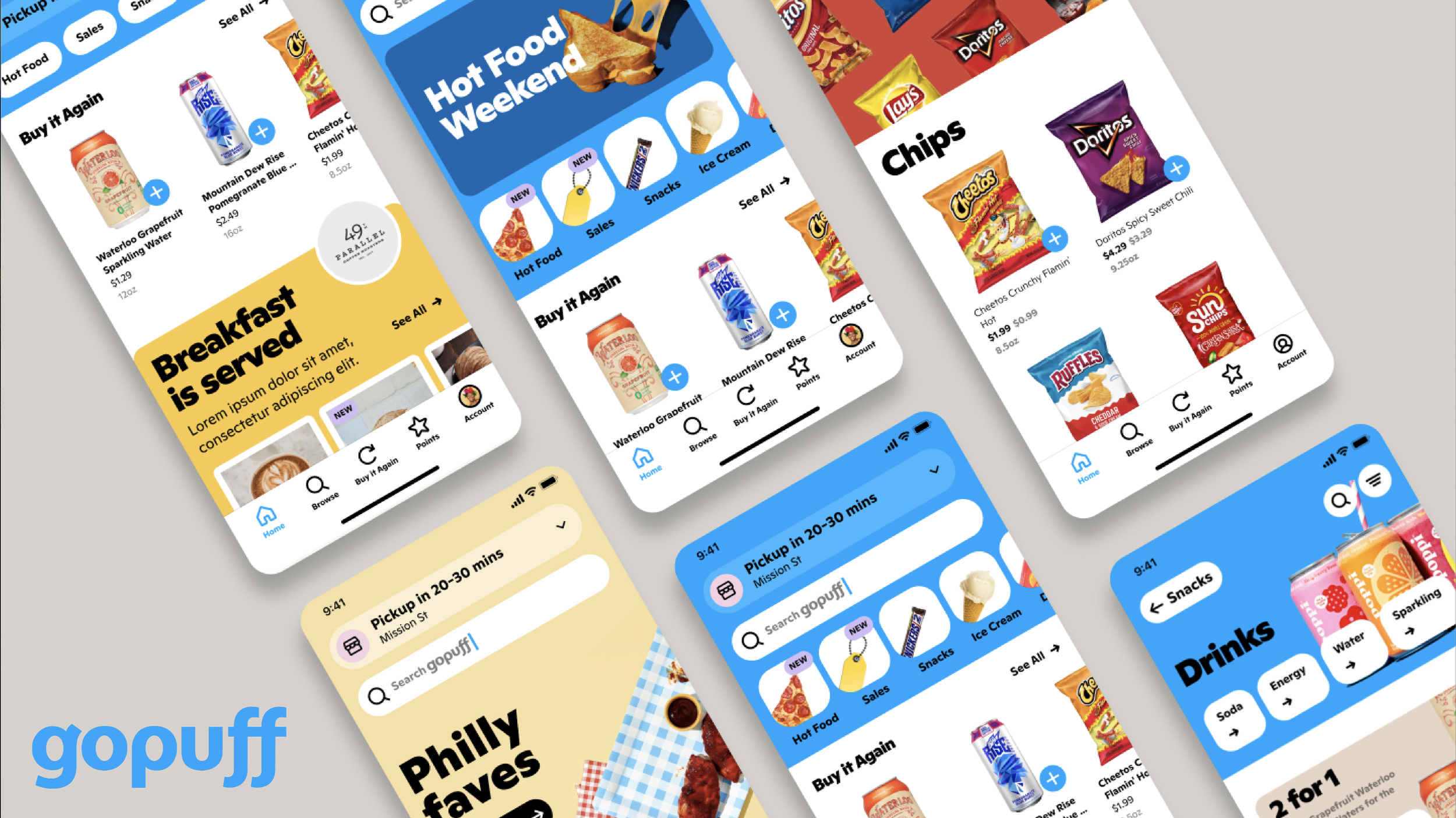
GoPuff is an American consumer goods and food delivery company that operates in over 650 US cities through approximately 500 micro-fulfilment centres. With Gopuff, customers can order snacks, essentials, alcohol, and more through our app or website. Once a customer enters their delivery address, they can see all the items available from the closest Gopuff facility. GoPuff then allows customers to add items to their bags and pay online.
My Role: Lead Product Designer
Tools & Methods: Hand Sketching, Moqup, Figma, Adobe Creative Suite, InVision, Project Management Tools, Design Thinking, User Research, Interviews, User Personas, Wireframes + User Journeys, User Flows, A/B Testing and Team Collaboration.
The Task:
Improve visibility on SERP. Redesign current IA structure to improve user experience and increase add-on sales. Update the design system with a focus on scalability.
SPECIFIC GOALS
Improve IA so users can easily navigate throughout the app/website.
Migrate the design library to an independent Figma file.
Ensure that components are updated throughout their multiple flows.
KEY METRICS
Improve visibility on the SERP through SEO and UX improvements.
Increase add-on sales by redesigning IA & UX. Reduce cart abandonment.
The ability for new team members to seamlessly adapt to their design framework.
The Results:
The team at GoPuff significantly reduced the bounce rate and increased organic searches for food delivery apps. They also had optimized files and an easy-to-use and maintain design system that ensured more team members would be set up for success when starting their journey with the company.
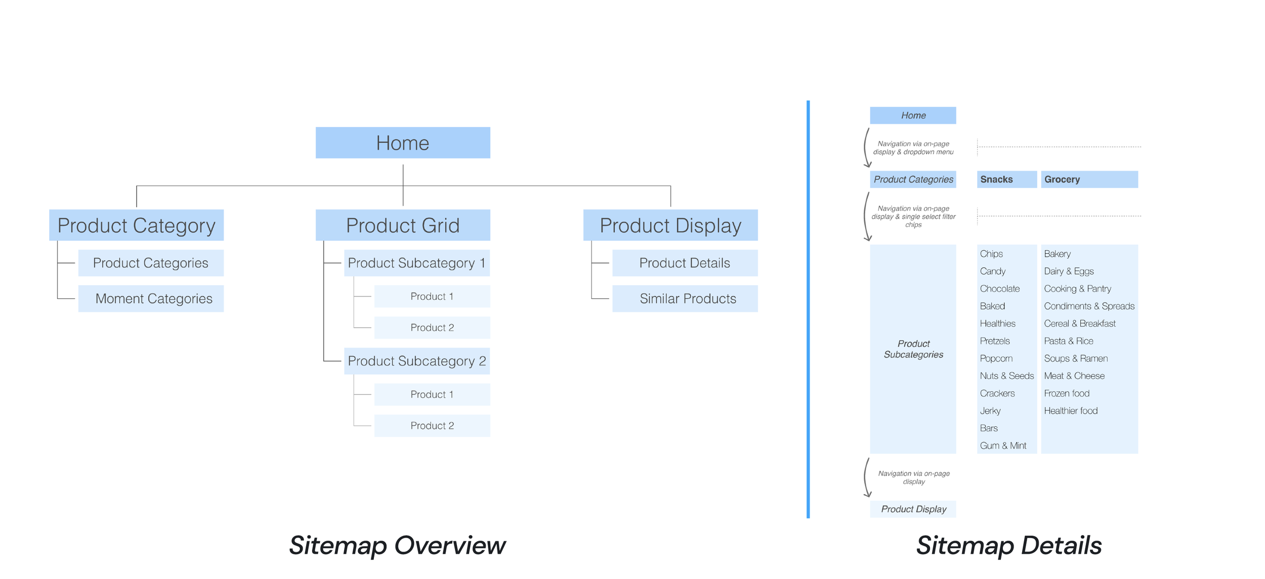
Organizational Schemes Issues
The current sitemap had several issues, such as;
Categories and subcategories lacked structured order.
Product categorization may have varying levels of speciality.
Both of these issues will confuse the user.
Organizational Schemes Recommendations
Improve categorization and structure by alphabetical organization.
Used card sorting and then A/B testing to uncover the most intuitive.
Provide logical structure and category organization that matches users’ mental models.
Low Fidelity Wireframes
Sketched out initial wireframes.
Collaborated with PM and developers at this stage to ensure we were aligned from a user perspective, technical feasibilities and business objectives.
High Fidelity Prototype
Converted low-fi wireframes into working prototypes.
We could now conduct various user research methods and gather crucial insights to improve the experience.
After numerous rounds of iterations, we A/B tested multiple designs against a control and determined a solution based on user data.
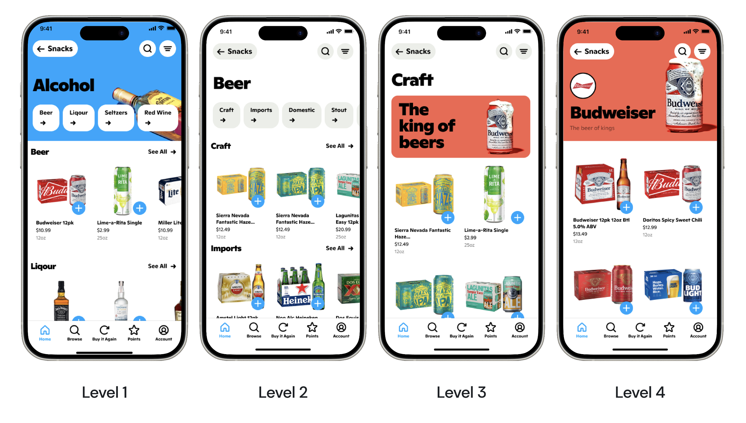
One solution was a simple improvement to the level navigation. This resulted in faster check-out times, reduced cart abandonment, and product discovery.
Improved Level Navigation
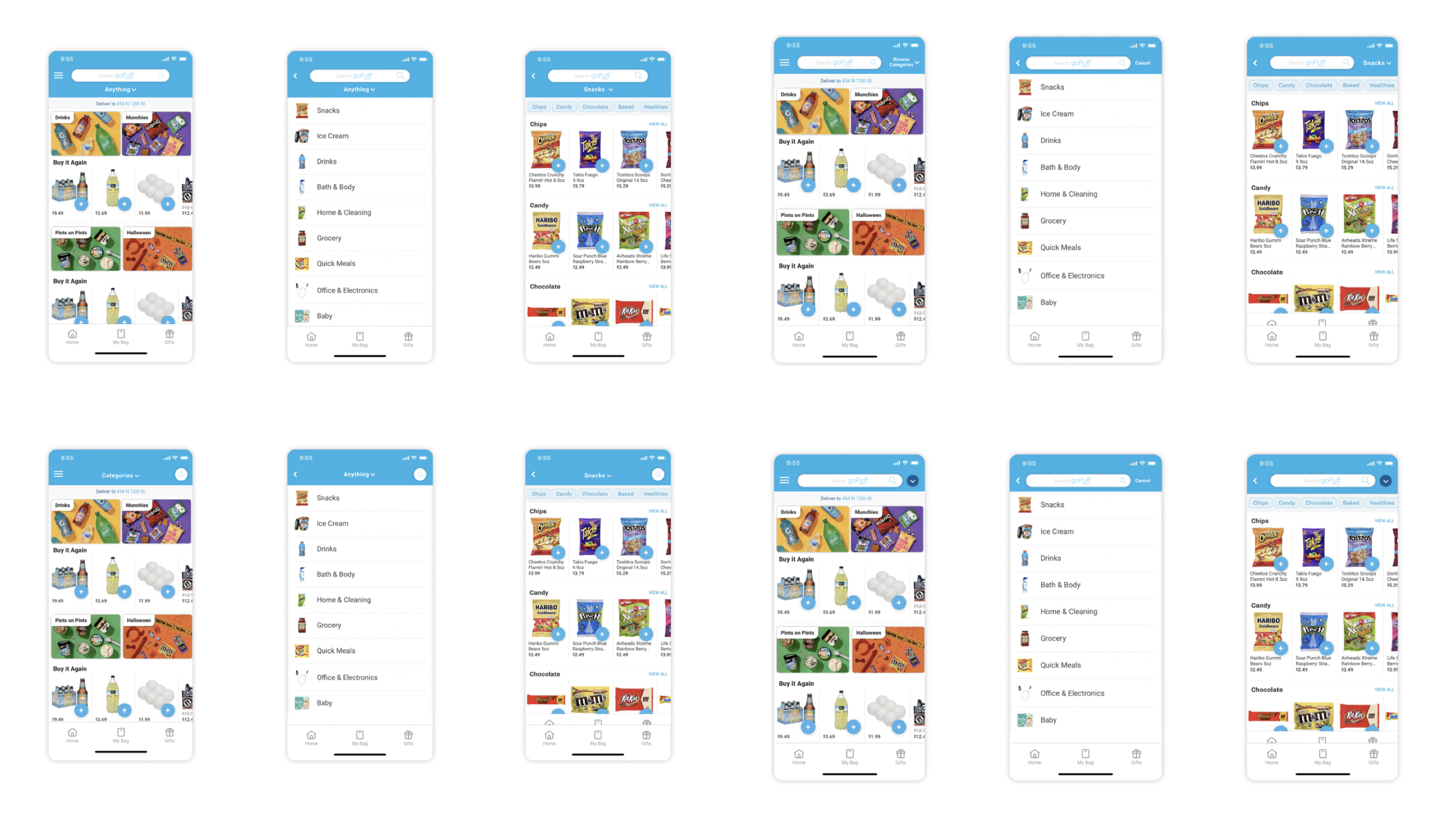
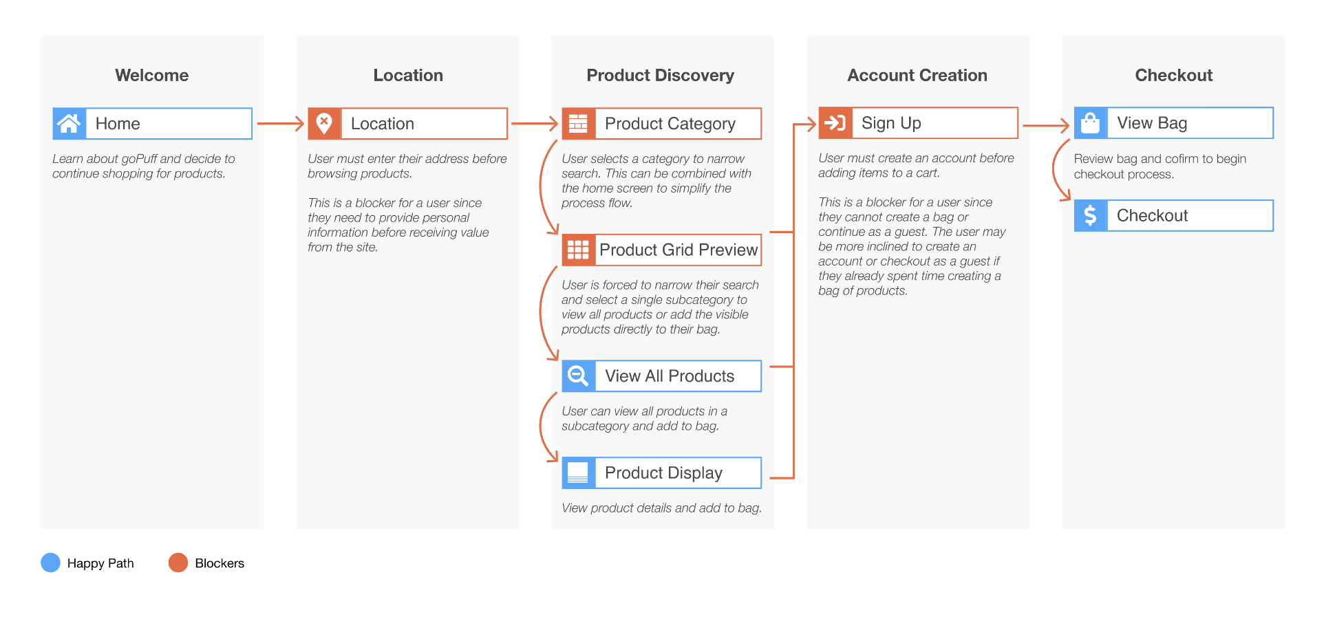
Current first-time user flow
Numerous clicks and steps cause users to get frustrated and leave the app.
Show user products as soon as possible to entice potential purchases and checkout.
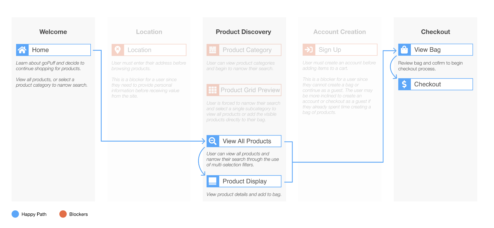
Proposed first-time user flow
Significantly reduce the number of steps for the user.
The user views products instantly, is engaged, and only needs to submit details on checkout.
We used A/B testing on our users, and the proposed flow was the clear winner.
Significantly reduce the number of steps for the user.
The user views products instantly, is engaged, and only needs to submit details on checkout.
We used A/B testing on our users, and the proposed flow was the clear winner.
The Task:
Designing for a B2B environment means improving processes, identifying friction points and improving situations for everyone. We needed to design for designers, and consider all roles for seamless interactions.
DISCOVERY
I had the opportunity to explore the client files in coordination with their team.
We conducted user research with numerous team members, including design, engineering, and product managers.
We were able to identify that their problem had two parts. Structural and Informational.
STRUCTURAL
When working with such a robust system, it’s essential to be mindful of the time it takes to implement change and how one can change it.
We used the atomic design structure. Ensuring that change would occur seamlessly.
INFORMATIONAL
Components were rearranged and thoroughly documented. Including:
Definition
Complexity level
Variations
Limitations
Use cases
Responsible parties
MOBILE APP SCREENS
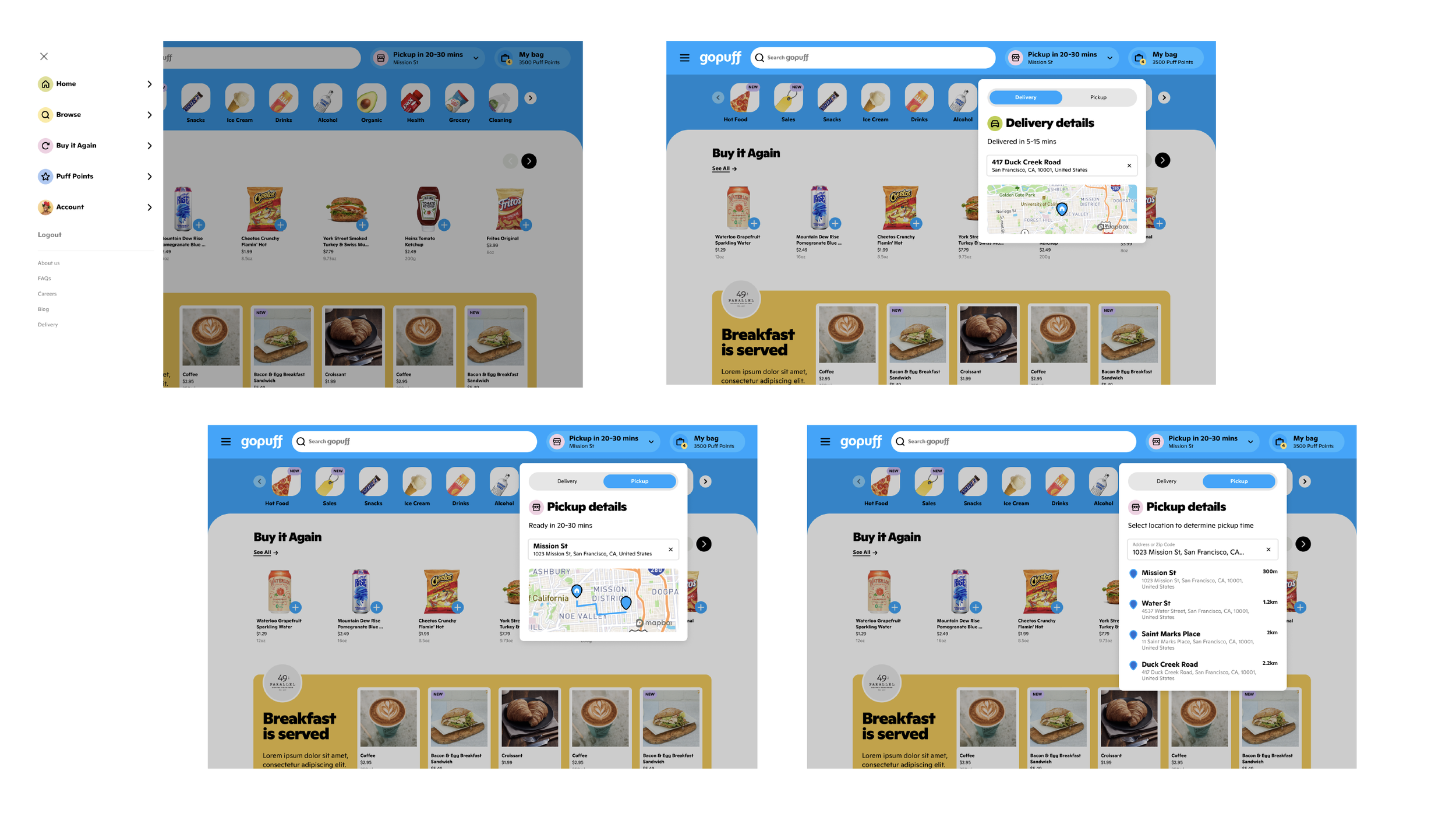
DESKTOP SCREENS
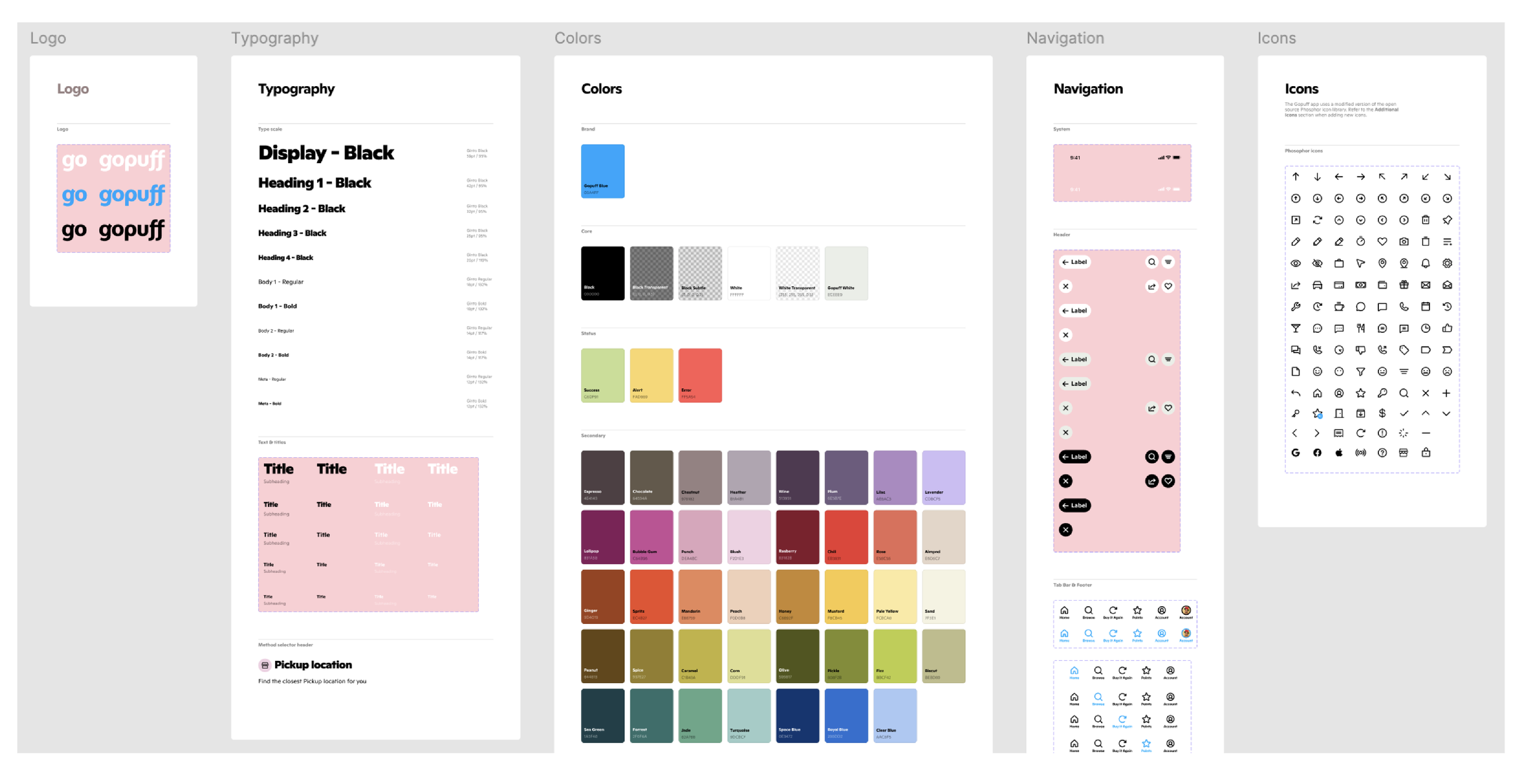
DESIGN SYSTEM SAMPLE


